Munchies

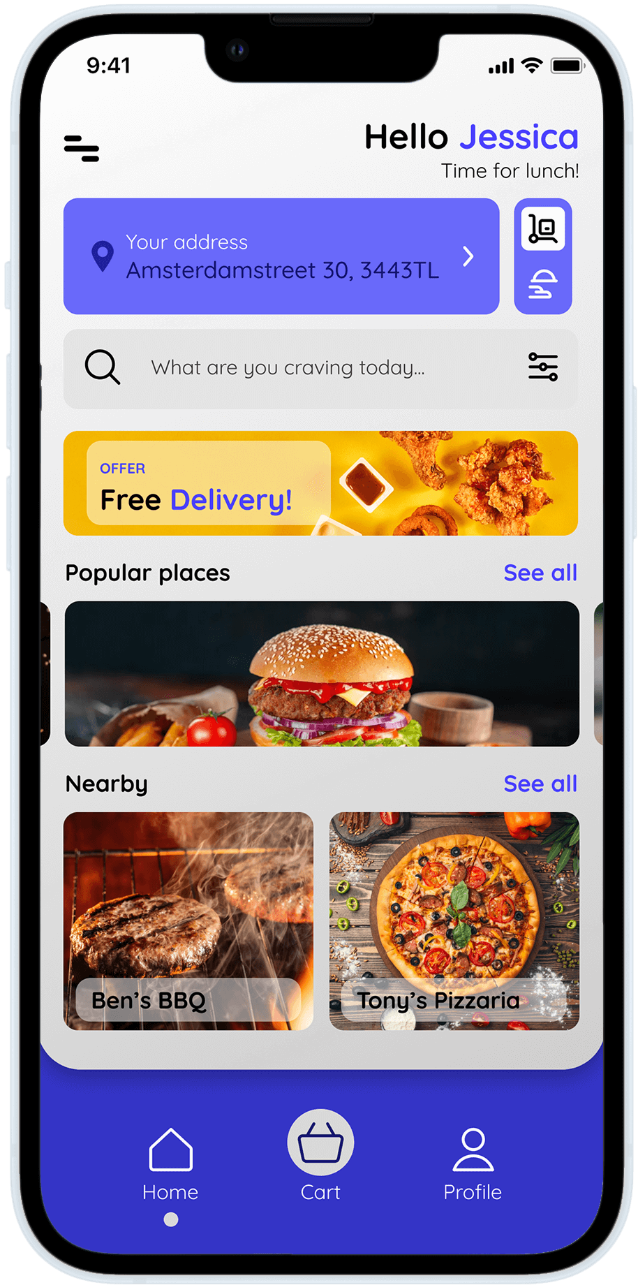
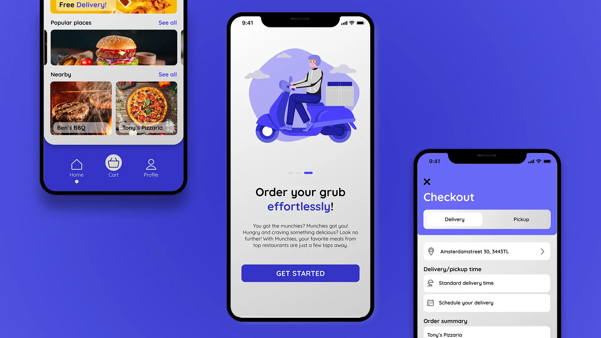
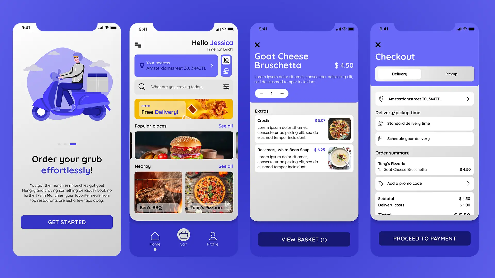
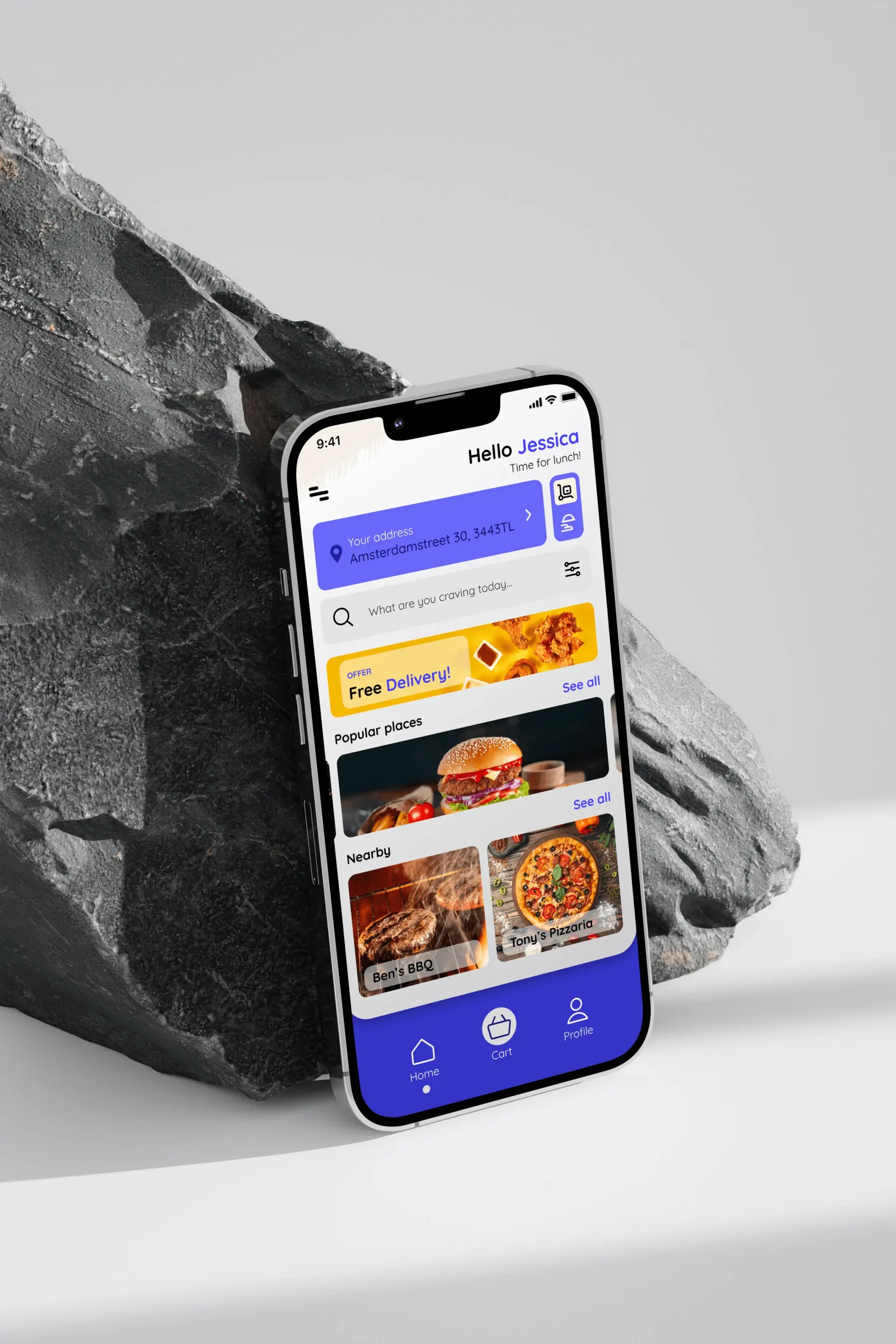
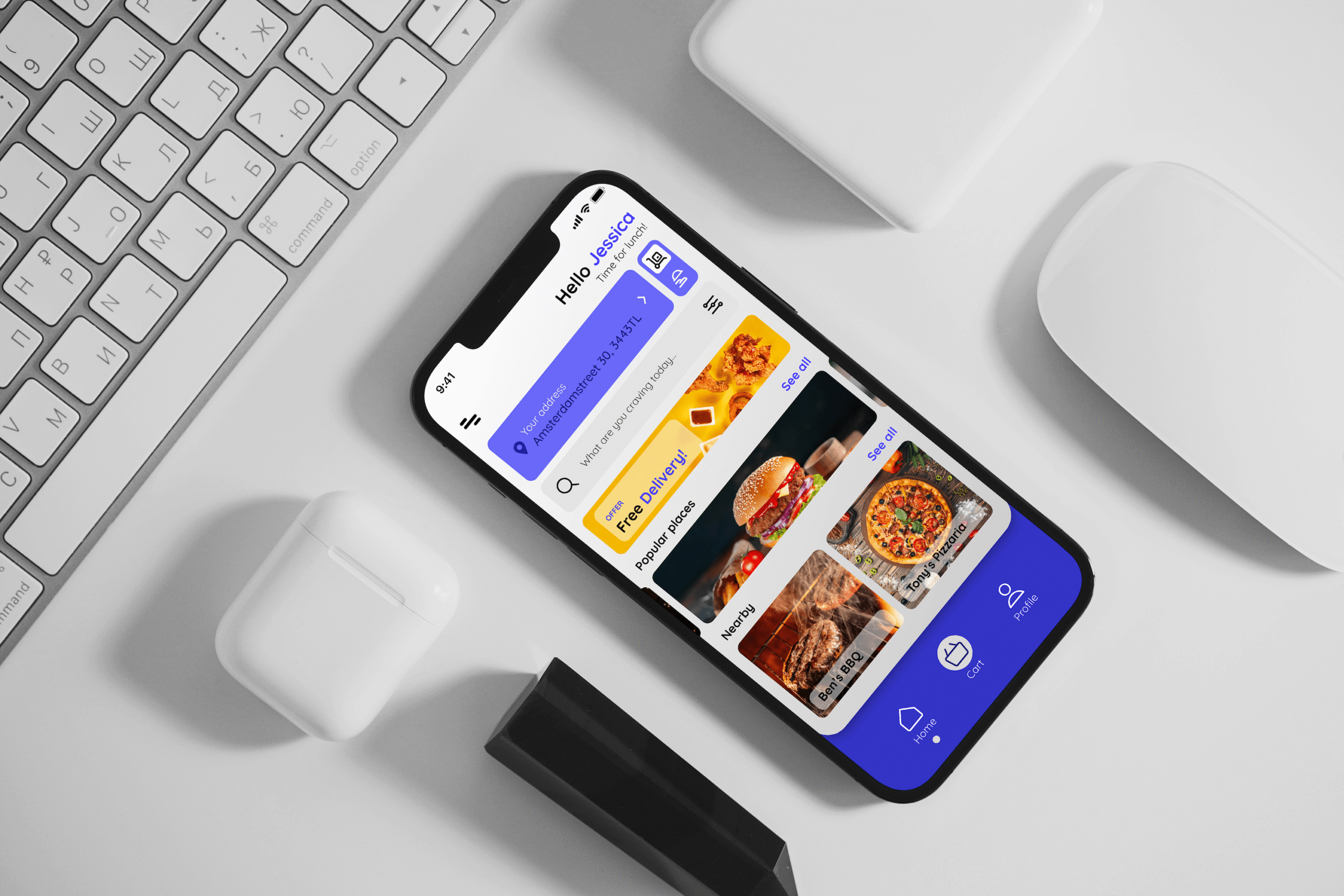
The design process involved researching industry best practices, studying how successful food apps guide users, and applying these insights to create a clean and functional design. Through each phase, I worked on translating (fictive) user needs into an accessible interface while experimenting with Figma’s interactive features to create a seamless user experience.

The Munchies Food App project allowed me to grow my skills in UI/UX design, giving me a foundation in user-focused design and enhancing my proficiency in Figma as a tool for creating interactive, functional app prototypes.
Client:

Munchies

Location:

Rotterdam, NL

Year:

2024

Goal

Key Components

  • UI/UX Basics: Focusing on clean, engaging layouts that align with industry standards helped me develop the basic principles of UI/UX design and gain a stronger understanding of usability.
  • Interactive Design in Figma: By designing interactions directly in Figma, I learned how to prototype flows and ensure a cohesive user experience throughout the app.
  • Research & Best Practices: I conducted thorough research into app design patterns and UX best practices in food and delivery apps, incorporating these strategies into the project.

Solution

A primary challenge of the Munchies Food App project was translating a brand identity into a functional and intuitive user interface. With no pre-existing brand guidelines, I needed to ensure that elements like color, typography, and layout choices were cohesive and aligned with a consistent style, all while creating a UI that enhanced the user experience. Balancing aesthetics with functionality required careful consideration of how each design choice would impact brand perception and usability.

Result

To solve this challenge, I began by defining a clear brand style guide, selecting a color palette and typography that conveyed the app’s approachable and energetic feel. I researched successful food and lifestyle apps to understand how they integrate branding elements into their UIs. This research informed my choices in applying color strategically—such as using bold colors for call-to-action buttons—and selecting typefaces that balanced readability with visual appeal. By building a style guide and prototyping directly in Figma, I was able to create a cohesive interface that maintained the brand’s identity while ensuring a smooth user experience.

Got any questions?

Need help with something? My aim is to make things easy. Don’t hesitate to reach out.

See other projects